UNIT-I
INTRODUCTION
- Human–computer interaction (HCI), alternatively man–machine interaction (MMI) or computer– human interaction (CHI) is the study of interaction between people (users) and computers.
- With today's technology and tools, and our motivation to create really effective and usable interfaces and screens.
DEFINITION
"Human-computer interaction is a discipline concerned with the design, evaluation and implementation of interactive computing systems for human use and with the study of major phenomena surrounding them."
GOALS
- A basic goal of HCI is
- to improve the interactions between users and computers
- By making computers more usable and receptive to the user's needs.
- A long term goal of HCI is
- to design systems that minimize the barrier between the human's cognitive model of what they want to accomplish and the computer's understanding of the user's task.
DEFINING THE USER INTERFACE
User interface, design is a subset of a field of study called human-computer interaction (HCI).
Human-computer interaction is the study, planning, and design of how people and computers work together so that a person's needs are satisfied in the most effective way.
HCI designers must consider a variety of factors:
- What people want and expect, physical limitations and abilities people possess,
- How information processing systems work,
- What people find enjoyable and attractive.
- Technical characteristics and limitations of the computer hardware and software must also be considered.
The user interface is to the part of a computer and its software that people can see, hear, touch, talk to, or otherwise understand or direct.
The user interface has essentially two components: input and output.
Input is how a person communicates his / her needs to the computer.
- Some common input components are the keyboard, mouse, trackball, one's finger, and one's voice.
Output is how the computer conveys the results of its computations and requirements to the user.
- Today, the most common computer output mechanism is the display screen, followed by mechanisms that take advantage of a person's auditory capabilities: voice and sound.
The use of the human senses of smell and touch output in interface design still remain largely unexplored.
Proper interface design will provide a mix of well-designed input and output mechanisms that satisfy the user's needs, capabilities, and limitations in the most effective way possible.
The best interface is one that it not noticed, one that permits the user to focus on the information and task at hand, not the mechanisms used to present the information and perform the task.
THE IMPORTANCE OF GOOD DESIGN
With today's technology and tools, and our motivation to create really effective and usable interfaces and screens, why do we continue to produce systems that are inefficient and confusing or, at worst, just plain unusable? Is it because:
- We don't care?
- We don't possess common sense?
- We don't have the time?
- We still don't know what really makes good design?
- But we never seem to have time to find out what makes good design, nor to properly apply it. After all, many of us have other things to do in addition to designing interfaces and screens.
- So we take our best shot given the workload and time constraints imposed upon us. The result, too often, is woefully inadequate.
- Interface and screen design were really a matter of common sense, we developers would have been producing almost identical screens for representing the real world.
THE IMPORTANCE OF THE USER INTERFACE
- A well-designed interface and screen is terribly important to our users. It is their window to view the capabilities of the system.
- It is also the vehicle through which many critical tasks are presented. These tasks often have a direct impact on an organization's relations with its customers, and its profitability.
- A screen's layout and appearance affect a person in a variety of ways. If they are confusing and inefficient, people will have greater difficulty in doing their jobs and will make more mistakes.
- Poor design may even chase some people away from a system permanently. It can also lead to aggravation, frustration, and increased stress.
The Benefits of Good Design
- Poor clarity forced screen users to spend one extra second per screen.
- Almost one additional year would be required to process all screens.
- Twenty extra seconds in screen usage time adds an additional 14 person years.
- The benefits of a well-designed screen have also been under experimental scrutiny for many years.
- One researcher, for example, attempted to improve screen clarity and readability by making screens less crowded.
- Separate items, which had been combined on the same display line to conserve space, were placed on separate line sin stead.
- The result screen users were about 20 percent more productive with the less crowded version.
- Proper formatting of information on screens does have a significant positive effect on performance.
- In recent years, the productivity benefits of well-designed Web pages have also been scrutinized.
- Training costs are lowered because training time is reduced.
- Support line costs are lowered because fewer assist calls are necessary.
- Employee satisfaction is increased because aggravation and frustration are reduced.
- Ultimately, that an organization's customers benefit because of the improved service they receive.
- Identifying and resolving problems during the design and development process also has significant economic benefits
- How many screens are used each day in our technological world?
- How many screens are used each day in your organization? Thousands? Millions
- Imagine the possible savings. Proper screen design might also, of course, lower the costs of replacing "broken" PCs.
INTRODUCTION OF THE GRAPHICAL USER INTERFACE
- The Xerox systems, Altus and STAR, introduced the mouse and pointing and selecting as the primary human-computer communication method.
- The user simply pointed at the screen, using the mouse as an intermediary.
- These systems also introduced the graphical user interface as we know it a new concept was born, revolutionizing the human-computer interface.
A BRIEF HISTORY OF SCREEN DESIGN
- While developers have been designing screens since a cathode ray tube display was first attached to a computer, more widespread interest in the application of good design principles to screens did not begin to emerge until the early 1970s, when IBM introduced its 3270 cathode ray tube text-based terminal.
- A 1970s screen often resembled the one pictured in Figure.
It usually consisted of many fields (more than are illustrated here) with very cryptic and often unintelligible captions.
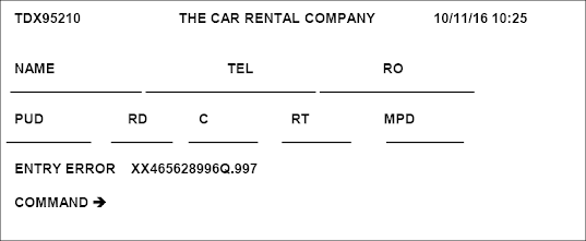
- It was visually cluttered, and often possessed a command field that challenged the user to remember what had to be keyed into it.
- Ambiguous messages often required referral to a manual to interpret.
- Effectively using this kind of screen required a great deal of practice and patience.
- Most early screens were monochromatic, typically presenting green text on black backgrounds.
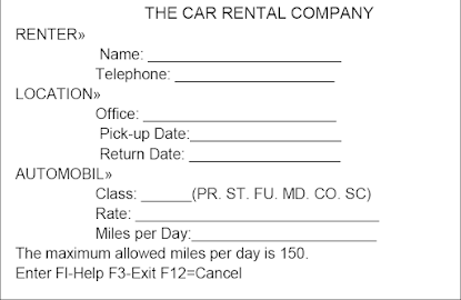
- At the turn of the decade guidelines for text-based screen design were finally made widely available and many screens began to take on a much less cluttered look through concepts such as grouping and alignment of elements, as illustrated in Figure 1.2.
- User memory was supported by providing clear and meaningful field captions and by listing commands on the screen, and enabling them to be applied, through function keys. Messages also became clearer.
- These screens were not entirely clutter-free, however. Instructions and reminders to the user had to be inscribed on the screen in the form of prompts or completion aids such as the codes PR and Sc.
- Not all 1980s screens looked like this, however. In the 1980s, 1970s-type screens were still being designed, and many still reside in systems today.
- The advent of graphics yielded another milestone in the evolution of screen design, as illustrated in Figure above.
- While some basic "design principles did not change, groupings and alignment, for example ,Borders were made available to visually enhance groupings and buttons and menus for implementing commands replaced function keys.
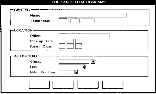
- Multiple properties of elements were also provided, including many different font sizes and styles, line thicknesses, and colors.
- The entry field was supplemented by a multitude of other kinds of controls, including list boxes, drop-down combination boxes, spin boxes, and so forth.
- These new controls were much more effective in supporting a person's memory, now simply allowing for selection from a list instead of requiring a remembered key entry.
- Completion aids disappeared from screens, replaced by one of the new listing controls. Screens could also be simplified, the much more powerful computers being able to quickly present a new screen.
- In the 1990s, our knowledge concerning what makes effective screen design continued to expand. Coupled with ever-improving technology, the result was even greater improvements in the user-computer screen interface as the new century dawned.
THE GRAPHICAL USER INTERFACE
- A user interface is a collection of techniques and mechanisms to interact with something.
- In a graphical interface the primary interaction mechanism is a pointing device of some kind.
- This device is the electronic equivalent to the human hand. What the user interacts with is a collection of elements referred to as objects.
- They can be seen, heard, touched, or otherwise perceived.
- Objects are always visible to the user and are used to perform tasks.
- They are interacted with as entities independent of all other objects.
- People perform operations, called actions, on objects. The operations include accessing and modifying objects by pointing, selecting, and manipulating. All objects have standard resulting behaviors.
THE POPULARITY OF GRAPHICS
- A graphical screen bore scant resemblance to its earlier text-based colleagues.
- Older text-based screen possessed a one dimensional
- Graphic screens assumed a three-dimensional look.
- Controls appeared to rise above the screen and move when activated.
- Information could appear and disappear, as needed.
- The text could be replaced by graphical images called icons.
- These icons could represent objects or actions
- selection fields such as radio buttons, check boxes, list boxes, and palettes that coexisted with the reliable old text entry field
- More sophisticated text entry fields with attached or dropdown menus of
- Objects and actions were selected through the use of pointing mechanisms.
- Increased computer power.
- User's actions to be reacted to quickly, dynamically, and meaningfully.
- WIMP interface: windows, icons, menus, and pointers.
- Graphic presentation is much more effective than other presentation methods.
- Properly used, it reduces the requirement for perceptual and mental information recording and reorganization and also reduces memory loads.
- It permits faster information transfer between computers and people by permitting more visual comparisons of amounts, trends, or relationships; a more compact representation of information;
- Graphics also can add appeal or charm to the interface and permit greater customization to create a unique corporate or organizational style.
GRAPHICAL SYSTEMS ADVANTAGES AND DISADVANTAGES
- Reduce the memory requirements.
- More effective use of one's information.
- Dramatically reduce system learning requirements.
- Experience indicates that for many people they have done all these things.
ADVANTAGES
- Symbols recognized faster than text
- Faster learning
- Faster use and problem solving
- Easier remembering
- More natural
- Exploits visual/spatial cues
- Fosters more concrete thinking
- Provides context
- Fewer errors
- Increased feeling of control
- Immediate feedback
- Predictable system responses
- Easily reversible actions
- Less anxiety concerning use
- More attractive
- May consume less space
- Replaces national languages
- Easily augmented with text displays
- Smooth transition from command language system
DISADVANTAGES
- Greater design complexity.
- Learning still necessary
- Replaces national languages
- Easily augmented with text displays
- Smooth transition from command language system
- Lack of experimentally derived design guidelines
- use a pointing device may also have to be learned
- Working domain is the present
- Human comprehension limitations
- Window manipulation requirements
- Production limitations
- Few tested icons exist
- Inefficient for touch typists
- Inefficient for expert users
- Not always the preferred style of interaction
- Not always fastest style of interaction
- Increased chances of clutter and confusion
- May consume more screen space
- Hardware limitations
THE CONCEPT OF DIRECT MANIPULATION
The system is portrayed as an extension of the real world: It is assumed that a person is already familiar with the objects and actions in his or her environment of interest.
The system simply replicates them and portrays them on a different medium, the screen. A person has the power to access and modify these objects, among which are windows.
A person is allowed to work in a familiar environment and in a familiar way, focusing on the data, not the application and tools.
The physical organization of the system, which most often is unfamiliar, is hidden from view and is not a distraction.
Continuous visibility of objects and actions: Like one's desktop, objects are continuously visible. Reminders of actions to be performed are also obvious, labeled buttons replacing complex syntax and command names.
Cursor action and motion occurs in physically obvious and natural ways. One problem in direct manipulation, however, is that there is no direct analogy on the desk for all necessary windowing operations.
A piece of paper on one's desk maintains a constant size, never shrinking or growing. Windows can do both. Solving this problem required embedding a control panel, a familiar concept to most people, in a window's border.
This control panel is manipulated, not the window itself. Actions are rapid and incremental with visible display of results; the results of actions are immediately displayed visually on the screen in their new and current form.
Auditory feedback may also be provided. The impact of a previous action is quickly seen, and the evolution of tasks is continuous and effortless. Incremental actions are easily reversible.
CHARACTERISTICS OF THE GRAPHICAL USER INTERFACE
A graphical system possesses a set of defining concepts. Included are sophisticated visual Presentation, pick-and click interaction, a restricted set of interface options, visualization, object orientation, extensive use of a person's recognition memory, and concurrent performance of functions.
Sophisticated Visual Presentation:
- Visual presentation is the visual aspect of the interface. It is what people see on the screen.
- The sophistication of a graphical system permits displaying lines, including drawings and icons.
- It also permits the displaying of a variety of character fonts, including different sizes and styles.
- The display of 16 million or more colors is possible on some screens. Graphics also permit animation and the presentation of photograph and motion video.
The meaningful interface elements visually presented to the user in a graphical System include windows (primary, secondary, or dialog boxes), menus (menu bar, pull down, pop- up, cascading),
icons to represent objects such as programs or files, assorted screen-based controls (text boxes, list boxes, combination boxes, settings, scroll bar and buttons), and a mouse pointer and cursor.
-- The objective is to reflect visually on screen the real world of the user as realistically, meaningfully, simply, and clearly possible.
A graphical system possesses a set of defining concepts. Included are sophisticated visual presentation, pick-and click interaction, a restricted set of interface options, visualization, object orientation, extensive use of a person's recognition memory, and concurrent performance of functions.
Restricted Set of Interface Options: The array of alternatives available to the user is what is presented on the screen or may be retrieved through what is presented on the screen, nothing less, and nothing more. This concept fostered the acronym WYSIWYG.
Pick-and-Click Interaction: Elements of a graphical screen upon which some action is to be performed must first identified.
- The motor activity required of a person to identify this element for a proposed action is commonly referred to as pick, the signal to perform an action as cue.
- The primary mechanism for performing this pick-and-click is most often the mouse and its buttons.
- The user moves the mouse pointer to the relevant element (pick) and the action is signaled (click).
- Pointing allows rapid selection and feedback. The hand and mind seem to work smoothly and efficiently together.
- The secondary mechanism for performing these selection actions is the keyboard most systems permit pick-and-click to be performed using the keyboard as well.
Visualization: Visualization is a cognitive process that allows people to understand Information that is difficult to perceive, because it is either too voluminous or too abstract.
Presenting specialized graphic portrayals facilitates visualization.
- The best visualization method for an activity depends on what People are trying to learn from the data.
- The goal is not necessarily to reproduce a really graphical image, but to produce one that conveys the most relevant information.
- Effective visualizations can facilitate mental insights, increase productivity, and for faster and more accurate use of data.
Object Orientation: A graphical system consists of objects and actions. Objects are what people see on screen. They are manipulated as a single unit.
- Objects can be composed of sub objects. For example, an object may be a document. The document's sub objects may be a paragraph, sentence, word, and letter.
- A collection is the simplest relationship-the objects sharing a common aspect.
- A collection might be the result of a query or a multiple selection of objects. Operations can be applied to a collection of objects.
- A constraint is a stronger object relationship. Changing an object in a set affects some other object in the set.
- A document being organized into pages is an example of a constraint. A composite exists when the relationship between objects becomes so significant that the aggregation itself can be identified as an object.
- Examples include a range of cells organized into a spreadsheet, or a collection of words organized into a paragraph.
- A container is an object in which other objects exist. Examples include text in a document or documents in a folder.
A container often influences the behavior of its content. It may add or suppress certain properties or operations of objects placed within it, control access to its content, or control access to kinds of objects it will accept. These relationships help define an object's type. Similar traits and behaviors exist in objects of the same object type.
Another important object characteristic is persistence. Persistence is the maintenance of a state once it is established. An object's state (for example, window size, cursor location, scroll position, and so on) should always be automatically preserved when the user changes it.
Use of Recognition Memory: Continuous visibility of objects and actions encourages use of a person's more powerful recognition memory. The "out of sight, out of mind" problem is eliminated
THE WEB USER INTERFACE
The expansion of the World Wide Web since the early 1990s has been truly amazing. Once simply a communication medium for scientists and researchers, its many and pervasive tentacles have spread deeply into businesses, organizations, and homes around the world.
Unlike earlier text-based and GUI systems that were developed and nurtured in an organization's Data Processing and Information Systems groups, the Web's roots were sown in a market-driven society thirsting for convenience and information.
Web interface design is essentially the design of navigation and the presentation of information. It is about content, not data.
Proper interface design is largely a matter of properly balancing the structure and relationships of menus, content, and other linked documents or graphics. The design goal is to build a hierarchy of menus and pages that feels natural, is well structured, is easy to use, and is truthful.
The Web is a navigation environment where people move between pages of information, not an application environment. It is also a graphically rich environment.
Web interface design is difficult for a number of reasons. First, its underlying design language, HTML, was never intended for creating screens to be used by the general population.
Its scope of users was expected to be technical. HTML was limited in objects and interaction styles and did not provide a means for presenting information in the most effective way for people.
Next, browser navigation retreated to the pre-GUI era. This era was characterized by a "command" field whose contents had to be learned, and a navigational organization and structure that lay hidden beneath a mostly dark and blank screen.
GUIs eliminated the absolute necessity for a command field, providing menus related to the task and the current contextual situation.
Browser navigation is mostly confined to a "Back" and "Forward" concept, but "back-to where" and "forward-to where" is often unremembered or unknown.
Web interface design is also more difficult because the main issues concern information Architecture and task flow, neither of which is easy to standardize.
It is more difficult because of the availability of the various types of multimedia, and the desire of many designers to use something simply because it is available.
It is more difficult because users are ill defined, and the user's tools so variable in nature.
The ultimate goal of a Web that feels natural, is well structured, and is easy to use will reach fruition.
THE POPULARITY OF THE WEB
While the introduction of the graphical user interface revolutionized the user interface, the Web has revolutionized computing.
It allows millions of people scattered across the globe to communicate, access information, publish, and be heard.
- It allows people to control much of the display and the rendering of Web pages.
- Aspects such as typography and colors can be changed, graphics turned off, and decisions made whether or not to transmit certain data over non secure channels or whether to accept or refuse cookies.
- Web usage has reflected this popularity. The number of Internet hosts has risen dramatically:
- In 1984, hosts online exceeded 1,000;
- In 1987, 10,000;
- In 1989,100,000,
- In 1990, 300,000;
- In 1992 hosts exceeded one million.
- Commercialization of the Internet saw even greater expansion of the growth rate. In 1993, Internet traffic was expanding at a 341,634 percent annual growth rate. In 1996, there were nearly 10 million hosts online and 40 million connected people (PBS Timeline).
- User control has had some decided disadvantages for some Web site owners as well.
- Users have become much more discerning about good design.
- Slow download times, confusing navigation, confusing page organization, disturbing animation, or other undesirable site features often results in user abandonment of the site for others with a more agreeable interface.
- People are quick to vote with their mouse, and these warnings should not go unheeded.
GUI VERSUS WEB PAGE DESIGN
- GUI and Web interface design do have similarities. Both are software designs, they are used by people, they are interactive, they are heavily visual experiences presented through screens, and they are composed of many similar components.
- Significant differences do exist.
CONCEPT GUI WEB
- User hardware variations limited
- User hardware characteristics well defined.
- Screens appear exactly as specified.
- User hardware variations enormous.
- Screen appearance influenced by hardware being used.
GRAPHICAL USER INTERFACE
- User hardware variations limited
- User hardware characteristics well defined.
- Screens appear exactly as specified.
- Data and applications
- Typically created and used by known and trusted sources.
- Properties generally known.
- Typically placed into system by users or known people and organizations.
- Typically organized in a meaningful fashion.
- A notion of private and shared data exists:
- Install, configure, personalize, start, use, and upgrade programs.
- Open, use, and close data files.
- Fairly long times spent within an application. Familiarity with applications often achieved.
- Controlled and constrained by program.
- Windows, menus, controls, data, tool bars, messages, and soon.
- Many transient, dynamically appearing and disappearing.
- Presented as specified by designer. Generally standardized by toolkits and style guides
- Through menus, lists, trees, dialogs, and wizards. Not a strong and visible concept.
- Constrained by design.
- Generally standardized by toolkits and
- Style guides. User Focus • Data and applications • Information and navigation
- Enables maintenance of a better sense of context. Restricted navigation paths.
- Multiple viewable windows Interactions such as clicking menu choices, pressing buttons, selecting list choices, and cut/copy/paste occur within context of active program.
- Nearly instantaneous.
- Typically prescribed and constrained by toolkit.
- Visual creativity allowed but difficult.
- Little significant personalization.
- Unlimited capability proportional to sophistication of hardware and software. Targeted to a specific audience with specific tasks. Only limited by the amount of programming undertaken to support it
- Major objective exists within and across applications. Aided by platform toolkit and design guidelines. Universal consistency in GUI products generally created through toolkits and design guidelines.
- Integral part of most systems and applications. Accessed through standard mechanisms. Documentation, both online and offline,
- Usually provided.
- Personal support desk also usually provided
- Seamless integration of all applications into the platform environment a major objective.
- Toolkits and components are key elements in accomplishing this objective
- Tightly controlled in business systems, proportional to degree of willingness to invest resources and effort
WEB
- User hardware variations enormous.
- Screen appearance influenced by hardware being used.
- Information and navigation
- Full of unknown content.
- Source not always trusted.
- Often not placed onto the Web by users or known people and organizations.
- Highly variable organization.
- Privacy often suspects
- Link to a site, browse or read pages, fill out forms, register for services, participate in transactions, download and save things.
- Movement between pages and sites very rapid. Familiarity with many sites not established.
- Infinite and generally unorganized.
- Two components, browser and page.
- Within page, any combination of text, images, audio, video, and animation.
- May not be presented as specified by the designer dependent on browser, monitor, and user specifications.
- Little standardization
- Through links: bookmarks, and typed URLs. Significant and highly visible concept.
- Few constraints, frequently causing a lost “sense of place “Few standards.
- Typically, part of page design, fostering an lack of consistency
- Poorer maintenance of a sense of context. Single-page entities.
- Unlimited navigation paths.
- Contextual clues become limited or are difficult to find.
- Basic interaction is a single click. This can cause extreme changes in context, which may not be noticed.
- Quite variable, depending on transmission speeds, page content, and so on. Long times can upset the user
- Fosters a more artistic, individual, and unrestricted presentation style.
- Complicated by differing browser and display capabilities, and bandwidth limitations.
- Limited personalization available.
- Limited by constraints imposed by the hardware, browser, software, client support, and user willingness to allow features because of response time, security, and privacy concerns
- No similar help systems.
- The little available help is built into the page. Customer service support, if provided, oriented to product or service offered.
- Apparent for some basic functions within most Web sites (navigation, printing, and so on.)
- Sites tend to achieve individual distinction rather than integration.
- Susceptible to disruptions caused by user, telephone line and cable providers, Internet service providers, hosting servers, and remotely accessed sites.
PRINCIPLES OF USER INTERFACE DESIGN
- An interface must really be just an extension of a person. This means that the system and its software must reflect a person's capabilities and respond to his or her specific needs.
- It should be useful, accomplishing some business objectives faster and more efficiently than the previously used method or tool did.
- It must also be easy to learn, for people want to do, not learn to do.
- Finally, the system must be easy and fun to use, evoking a sense of pleasure and accomplishment not tedium and frustration.
- The interface itself should serve as both a connector and a separator
- A connector in that it ties the user to the power of the computer, and a separator in that it minimizes the possibility of the participants damaging one another.
- While the damage the user inflicts on the computer tends to be physical (a frustrated pounding of the keyboard), the damage caused by the computer is more psychological.
- Throughout the history of the human-computer interface, various researchers and writers have attempted to define a set of general principles of interface design.
- What follows is a compilation of these principles. They reflect not only what we know today, but also what we think we know today.
- Many are based on research, others on the collective thinking of behaviorists working with user interfaces.
- These principles will continue to evolve, expand, and be refined as our experience with Gills and the Web increases.
PRINCIPLES FOR THE XEROX STAR
- The design of the Xerox STAR was guided by a set of principles that evolved over its lengthy development process. These principles established the foundation for graphical interfaces.
- Displaying objects that are selectable and Mani pulable must be created.
- A design challenge is to invent a set of displayable objects that are represented meaningfully and appropriately for the intended application.
- It must be clear that these objects can be selected, and how to select them must be Self- evident.
- When they are selected should also be obvious, because it should be clear that the selected object will be the focus of the next action. Standalone icons easily fulfilled this requirement.
- The handles for windows were placed in the borders.
- Visual order and viewer focus: Attention must be drawn, at the proper time, to the important and relevant elements of the display. Effective visual contrast between various components of the screen is used to achieve this goal. Animation is also used to draw attention, as is sound.
Feedback must also be provided to the user. Since the pointer is usually the focus of viewer attention, it is a useful mechanism for providing this feedback (by changing shapes).
- Revealed structure: The distance between one's intention and the effect must be minimized. Most often, the distance between intention and effect is lengthened as system power increases. The relationship between intention and effect must be, tightened and made as apparent as possible to the user. The underlying structure is often revealed during the selection process.
- Consistency: Consistency aids learning. Consistency is provided in such areas as element location, grammar, font shapes, styles, and sizes, selection indicators, and contrast and emphasis techniques.
- Appropriate effect or emotional impact: The interface must provide the appropriate emotional effect for the product and its market. Is it a corporate, professional, and secure business system? Should it reflect the fantasy, wizardry, and bad puns of computer games?
- A match with the medium: The interface must also reflect the capabilities of the device on which it will be displayed. Quality of screen images will be greatly affected by a device's resolution and color-generation capabilities.
GENERAL PRINCIPLES
- The design goals in creating a user interface are described below.
- They are fundamental to the design and implementation of all effective interfaces, including GUI and We bones.
- These principles are general characteristics of the interface, and they apply to all aspects.
- The compilation is presented alphabetically, and the ordering is not intended to imply degree of importance.
Aesthetically Pleasing
Provide visual appeal by following these presentation and graphic design principles:
- Provide meaningful contrast between screen elements.
- Create groupings.
- Align screen elements and groups.
- Provide three-dimensional representation.
- Use color and graphics effectively and simply.
Clarity
The interface should be visually, conceptually, and linguistically clear, including
- Visual elements
- Functions
- Metaphors
- Words and Text
Compatibility
Provide compatibility with the following:
- The user
- The task and job
- The Product
- Adopt the User’s Perspective
Configurability
Permit easy personalization, configuration, and reconfiguration of settings.
- Enhances a sense of control
- Encourages an active role in understanding
Comprehensibility
A system should be easily learned and understood: A user should know the following:
- What to look at
- What to do
- When to do it
- Where to do it
- Why to do it
- How to do it
The flow of actions, responses, visual presentations, and information should be in a sensible order that is easy to recollect and place in context.
Consistency
A system should look, act, and operate the same throughout. Similar components should:
- Have a similar look.
- Have similar uses.
- Operate similarly.
- The same action should always yield the same result
- The function of elements should not change.
- The position of standard elements should not change.
Control
- The user must control the interaction.
- Actions should result from explicit user requests.
- Actions should be performed quickly.
- Actions should be capable of interruption or termination.
- The user should never be interrupted for errors
- The context maintained must be from the perspective of the user.
- The means to achieve goals should be flexible and compatible with the user's skills, experiences, habits, and preferences.
- Avoid modes since they constrain the actions available to the user.
- Permit the user to customize aspects of the interface, while always providing a Proper set of defaults
Provide direct ways to accomplish tasks.
- Available alternatives should be visible.
- The effect of actions on objects should be visible.
Flexibility
A system must be sensitive to the differing needs of its users, enabling a level and type of performance based upon:
- Each user's knowledge and skills.
- Each user's experience.
- Each user's personal preference.
- Each user's habits.
- The conditions at that moment.
Efficiency
Minimize eye and hand movements, and other control actions.
- Transitions between various system controls should flow easily and freely.
- Navigation paths should be as short as possible.
- Eye movement through a screen should be obvious and sequential.
- Anticipate the user's wants and needs whenever possible.
Familiarity
- Employ familiar concepts and use a language that is familiar to the user.
- Keep the interface natural, mimicking the user's behavior patterns.
- Use real-world metaphors.
Forgiveness
- Tolerate and forgive common and unavoidable human errors.
- Prevent errors from occurring whenever possible.
- Protect against possible catastrophic errors.
- When an error does occur, provide constructive messages.
Predictability
- The user should be able to anticipate the natural progression of each task.
- Provide distinct and recognizable screen elements.
- Provide dues to the result of an action to be performed.
- All expectations should be fulfilled uniformly and completely.
Recovery
A system should permit:
- Commands or actions to be abolished or reversed.
- Immediate return to a certain point if difficulties arise.
Ensure that users never lose their work as a result of:
- An error on their part.
- Hardware, software, or communication problems
Responsiveness
The system must rapidly respond to the user's requests provide immediate Acknowledgment for all user actions:
- Visual.
- Textual
- Auditory.
Transparency
Permit the user to focus on the task or job, without concern for the mechanics of the interface.
Workings and reminders of workings inside the computer should be invisible to the user.
Simplicity
Provide as simple an interface as possible. Five ways to provide simplicity:
- Use progressive disclosure, hiding things until they are needed
- Present common and necessary functions first
- Prominently feature important functions
- Hide more sophisticated and less frequently used functions.
- Provide defaults.
- Minimize screen alignment points.
- Make common actions simple at the expense of uncommon actions being made harder.
- Provide uniformity and consistency.


No comments:
Post a Comment