Unit-III
SCREEN DESIGNING
What screen users want
an orderly clean clutter free appearance
An obvious indication of what is being shown and what should be done with it.
Expected information located where it should be.
A clear indication of what relates to what.
Plain and simple English
A clear indication of when an action can make a permanent change in data
Design goals
Reduce visual work
Reduce intellectual work
Reduce memory work
Reduce mentor work
Eliminate burdens or instructions.
SCREEN PLANNING AND PURPOSE
Each screen element
Every control
All text
Screen organization
All emphasis
Each color
Every graphic
All screen animation
All forms offered back
Must
Have meaning to screen users
Serve a purpose in performing task organizing screen elements
Consistency
Provide real world consistency
Provide internal consistency
Operational and navigational procedures
Visual identity or theme
Component
Organization
Presentation
Usage
Locations
Follow the same conventions
Deviate only when there is clear benefit to user
ORDERING OF SCREEN DATA & CONTENT
Divide information into units that are logical, meaningful and sensible.
Organize by interrelationships between data or information.
Provide an ordering of screen units of elements depending on priority.
Possible ordering schemes include
Conventional
Sequence of use
Frequency of use
Function
Importance
General to specific.
Form groups that cover all possibilities.
Ensure that information is visible.
Ensure that only information relative to task is presented on screen.
Organizational scheme is to minimize number of information variables.
Upper left starting point
Provide an obvious starting point in the screen’s upper left Corner.
SCREEN NAVIGATION AND FLOW
Provide an ordering of screen information and elements that:
is rhythmic guiding a person’s eye through display
Encourages natural movement sequences.
Minimizes pointer and eye movement distances.
Locate the most important and most frequently used elements or controls at top left.
Maintain top to bottom, left to right flow.
Assist in navigation through a screen by
Aligning elements
Grouping elements
Use of line borders
Through focus and emphasis, sequentially, direct attention to items that are
Critical
Important
Secondary
Peripheral
Tab through window in logical order of displayed information.
locate command button at the end of the tabbing order sequence,
When groups of related information must be broken and displayed on separate screens, provide breaks at logical or natural points in the information flow.
In establishing eye movement through a screen, also consider that the eye trends to move sequentially, for example–
From dark areas to light areas
From big objects to little objects
From unusual shapes to common shapes.
From highly saturated colors to unsaturated colors.
These techniques can be initially used to focus a person’s attention.
Maintain top to bottom, left to right through the screen. This top to bottom orientation is Recommended for information entry for the following reasons–
Eye movements between items will be shorter.
Control movements between items will be shorter.
Groupings are more obvious perceptually.
When one’s eyes moves away from the screen and then back, it returns to about same place it left, even if it is seeking next item in sequence.
Most product style guides recommend a left to right orientation.
Our earliest display screens reflected this left to right entry orientation.
Top to bottom orientation is also recommended for presenting displays of read only information that must be scanned.
VISUALLY PLEASING COMPOSITION
Provide visually pleasing composition with the following qualities–
Balance
Symmetry
Regularity
Predictability
Sequentiality
Economy
Unity
Proportion
Simplicity
Groupings
Balance: Create screen balance by providing an equal weight of screen elements, left and right, top and bottom.
Balance Instability
Symmetry: Create symmetry by replicating elements left and right of the screen centerline.
Symmetry Asymmetry
Regularity: Create regularity by using consistently spaced column and row starting points for widgets. Also use elements similar in size shape, color and spacing.
Regularity Irregularity
Predictability: Create predictability by being consistent and following conventional orders or arrangements.
Predictability Spontaneity
Sequentiality: Provide sequentiality by arranging elements to guide the eye through the screen in an obvious, logical, rhythmic, and efficient manner.
Sequentiality Randomness
Economy: Provide economy by using as few styles, display techniques, and colors as possible.
Economy Intricacy
Unity: Create unity by using similar sizes, shapes, or colors for related information. Also by leaving less space between elements of a screen than the space left in the margins.
Unity Fragmentation
Proportion: Create windows and groupings of data or text with aesthetically pleasing proportions.
Square 1:1
Square-root of two 1:1.414
Golden rectangle 1:1.618
Square-root of three 1:1.732
Double square 1:2
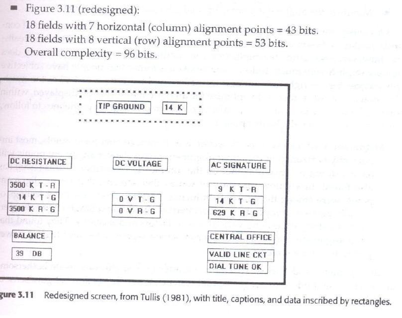
Simplicity: Optimize the number of elements on a screen, within the limits of clarity. Minimize the alignment points, especially horizontal and vertical.
Simplicity Complexity
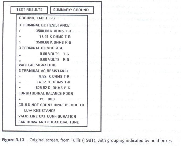
Groupings: GROUPING USING BORDERS
Provide functional groupings
Create spatial groupings
Provide meaningful titles for each grouping
Incorporate line borders
Do not exceed three-line thickness
Create lines consistent in height and length
For adjacent groupings with borders wherever possible
Use rules and borders sparingly

Amount of Information
Present the proper information for the task
Present all the information necessary for performing an action or making a decision on one screen, whenever possible.
Restrict screen or window density levels to no more than about 30 percent
Focus & Emphasis: Visually emphasize the
Most prominent element
Most important elements
Central idea or focal point
Deemphasize less important elements
To ensure that too many screen elements are emphasized
Screen clutter
Using too many emphasize techniques
To provide emphasis use techniques such as: Higher brightness
Reverse polarity
Larger and distinctive font
Underlining
Blinking
Line rulings
Contrasting colors
Larger size
Positioning
Isolation
Distinctiveness
White space
Provide information Simply & Meaningfully
Provide legibility
Provide readability
Present information in usable form
Utilize contrasting display features
Create visual lines
Be consistent
INFORMATION RETRIEVAL ON WEB
The most sought-after web commodity is content.
Behavior is often goal driven.
Reading is no longer a linear activity.
Impatience.
Frequent switching of purpose.
Web users access site for different reasons: a focused search for a piece of information or an answer less focused for browsing or surf.
High tech capabilities, fancy graphics do not compensable for inefficient or poor content.
Initial focus on attention
Page perusal
Scanning guidelines
Browsing
Browsing guidelines
Searching
Problems with search facilities
Search facility guidelines
Express the search
Progressive search refinement
Launch the search
Present meaningful results
Provide meaningful headings and subheadings.
Provide meaningful titles
Concisely write the text.
Use bullets/number
Array information in tables
Presentation
Key information in words or phrases
Important concepts
STATISTICAL GRAPHICS
A statistical graphic is data presented in a graphical format.
A well-designed statistical graphic also referred to as chart or graph.
Use of statistical graphics
Reserve for material that is rich, complex or difficult.
Data Presentation
emphasize the data
Minimize non data elements
Minimize redundant data
Fill the graph’s available area with data.
Show data variation
Provide proper context for data interpretation.
Scales and shading
Place ticks to marks scales on the outside edge of each axis.
Employ a linear scale.
mark scales at standard or customary intervals
Start a numeric scale at zero.
Display only a single scale on axis.
Provide aids for scale interpretation.
Clearly label each axis.
Provide scaling consistency
Consider duplicate axis for large scale data.
Proportion
Lines
Labeling
Title
Interpretation of numbers
TYPES OF STATISTICAL GRAPHS
curve and line graphs
Single graph
Four or five maximum
Label identification
Legend
Tightly packed curves
Important or critical data
Comparing actual and projected data
Data differences
Surface charts
Ordering
Coding schemes
Labels
Scatter plots
two dimensions
Consistent intervals
multiple datasets
Significant points
Bar graphs
consistent orientation
Meaningful organization
Bar spacing
Differentiation
Important or critical data
Related bar ordering
Reference index
labeling
Segmented or stacked bars.
Data category ordering
Large segments
Coding schemes
labeling
Flowcharts
Order of steps
Orientation
Coding conventions
Arrows
Highlighting
One decision at each step
Consistently order and word all choices
Pie chart
TECHNOLOGICAL CONSIDERATION -INTERFACE DESIGN
Graphical systems
Screen design must be compatible with the capabilities of the system–
system power
Screen size
Screen resolution
Display colors
Other display features
Screen design must be compatible with the capabilities of the
Platform compatibility
development and implementation
Platform style guide
Browser compatibility
Monitor size and resolution Fonts
Color
Bandwidth
Version
Other considerations
Downloading
Currency
Page printing
Maintainable


No comments:
Post a Comment