UNIT-IV
SELECT THE PROPER KINDS OF WINDOWS
A window is an area of the screen that contains a particular view of some area of the computer or some portion of a person’s dialog with the computer.
Navigation Goals:
A well designed navigation system facilitates quick & easy navigation between components whose structure & relationship are easily comprehensible.
For the user, answers to the following questions must be obvious at all times during an interaction: Where am I now? Where did I come from? Where can I go from here? How can I get there quickly?
General system navigation guidelines include the following.
Control
For multilevel menus, provide one simple action to:
Return to the next higher-level menu.
Return to the main menu.
Provide multiple pathways through a menu hierarchy whenever possible.
Menu Navigation Aids
To aid menu navigation & learning, provide an easily accessible:
Menu map or overview of the menu hierarchy.
A “look ahead” at the next level of choices, alternatives that will be presented when a currently viewed choice is selected.
Navigation history.
Web Site Navigation:
In designing a Web Site Navigation scheme there are two things to take in consideration:
Never assume that users know as much about a site as the site designers do.
Any page can be an entry point into the website.
Web site navigational design includes:
Web site organization Divide content into logical fragments, units or chunks.
Establish a hierarchy of generality or importance.
Components of a Web Navigation System to move between Web site information fragments necessitates the creation of navigation links.
General link guidelines are:
-Sensible
-Available
-Obvious & Distinctive
-Consistent
-Textual
-Provide multiple navigation paths
Browser Command Buttons Hide the split between the browser & the Web site application by including navigational controls within the application.
Web Site Navigation Bars
Provide a global navigation bar at the top of each page.
Provide a local category or typical links navigation bar on the left side of a page.
Textual Phrases
Provide a mix of textual phrase links: -In explicit menus. -Embedded within page text.
Graphical Images or Icons
Graphical images or icons may appear in an array in the form of a navigation bar or be individually located at relevant points in a page.
Command Buttons
Command buttons may appear in an array in the form of a navigation bar or be individually located at relevant points in a page.
Selection of Window:
Window Characteristics
A name or title, allowing it to be identified.
A size in height & width (which can vary).
A state, accessible or active or not accessible.
Visibility–the portion can be seen.
A location relative to the display boundary.
Presentation–its arrangement with respect to other windows.
Management capabilities.
Highlighting.
The function, task or application to which it is dedicated.
Attraction of Windows
Presentation of Different Levels of Information.
Presentation of Multiple Kinds of Information.
Sequential Presentation of Levels or Kinds of Information.
Access to Different Sources of Information.
Combining Multiple Sources of Information.
Performing More Than One Task.
Reminding.
Monitoring.
Multiple Representations of the Same Task.
Constraints in Window System Design
Historical Considerations
Hardware Limitations
Human Limitations
Window Management
Single-Document Interface
It’s a single primary window with a set of secondary windows.
Multiple-Document Interface
It’s a technique for managing a set of windows where documents are opened into windows. Contains:
-A single primary window called the parent.
-A set of related document or child windows, each also essentially a primary window.
Organizing Window Functions
Window Organization–organize windows to support user tasks.
Number of Windows–minimize the number of windows needed to accomplish an objective.
Window Operations
Active window
A window should be made active with as few steps as possible.
Visually differentiate the active window from other windows.
Opening a window
Provide an iconic representation or textual list of available windows.
If more than one object is selected & opened, display each object in a separate window. Designate the last window selected as the active window.
Sizing windows
Provide large-enough windows to present all relevant & expected information for the task.
Window placement
Position the window so it is entirely visible.
Window separation
Crisply, clearly & pleasingly demarcate a window from the background of the screen on which it appears.
Moving a window
Permit the user to change the position of all windows.
Vii .Resizing a window
Permit the user to change the size of primary windows.
Select the Proper Device-Based Controls
Device-based controls, often called input devices, are the mechanisms through which people communicate their desires to the system.
Identify the characteristics and capabilities of device-based control
Trackball
Joystick
Graphic tablet
Light pen
Touch screen
Voice
Mouse
Keyboard
Trackball
Description
– A ball that rotates freely in all directions in its socket
Advantages
Direct relationship between hand and pointer movement in terms of direction and speed
Does not obscure vision onscreen
Does not require additional desk space (if mounted on keyboard)
Disadvantage
Movement indirect, in plane different from screen
Requires hand to be removed from keyboard keys
Requires different hand movements
May be difficult to control
May be fatiguing to use over extended time
Joystick
Advantages
Direct relationship between hand and pointer movement in terms of direction and speed
Does not obscure vision on screen
Does not require additional desk space (if mounted on keyboard)
Disadvantage
Movement indirect, in plane different from screen
Requires hand to be removed from keyboard keys
Requires different hand movements
May be difficult to control
May be fatiguing to use over extended time
May be slow and inaccurate.
Graphic (Touch) Tablet
Description
Pressure-, heat-,light-, or light-blockage-sensitive horizontal surfaces that lie on the desktop or keyboard
May be operated with fingers, light pen, or objects like pencil
Advantages
Direct relationship between hand and pointer movement in terms of direction and speed
Does not obscure vision of screen
More comfortable horizontal operating plane
Disadvantage
Movement is indirect, in a plane different from screen
Requires hand to be removed from keyboard
Requires different hand movements to use
Finger may be too large for accuracy with small objects
Touch Screen
Advantages
Direct relationship between hand and pointer movement in terms of direction and speed
Movement is direct, in the same plane as screen
Requires no additional desk space
Disadvantage
Finger may obscure part of screen
Finger may be too large for accuracy with small objects
Requires moving the hand far from the keyboard to use
Very fatiguing to use for extended period of time
May Damage the screen
Light Pen
Description
A special surface on a screen sensitive to the touch of a special stylus pen
Advantage
Direct relationship between hand and pointer movement in terms of direction, distance, and speed
Movement is direct, in the same plane as screen
Requires minimal additional desk space
Stands up well in high-use environments
More accurate than finger touching
Disadvantage
Hand may obscure part of screen
Requires picking it to use
Requires moving the hand far from the keyboard to use
Very fatiguing to use for extended period over time
Voice
Description
– Automatic speech recognition by the computer
Advantage
Simple and direct
Useful for people who cannot use a keyboard
Useful when the user’s hands are occupied
Disadvantage
High error rates due to difficulties in
Recognizing boundaries between spoken words
Blurred word boundaries due to normal speech patterns
Slower throughput than with typing
Difficult to use in noisy environment
Impractical to use in quiet environment
Mouse
Advantage
Direct relationship between hand and pointer movement in terms of direction, distance, and speed.
Permit a comfortable hand resting position
Selection mechanisms are included on mouse
Does not obscure vision of the screen
Disadvantage
Movement is indirect, in a plane different from screen
Requires hand to be removed from keyboard
Requires additional desk space
May require long movement distances
Requires a degree of eye-hand coordination
Mouse Usage Guidelines
Provide a “hot zone” around small or thin objects that might require extremely fine mouse positioning
Never use double-clicks or double drags as the only means of carrying out essential operations
Do not use mouse plus keystroke combinations
Do not require a person to point at a moving target
Keyboard
Advantage
Familiar
Accurate
Does not take up additional desk space
Very useful for
Entering text and alphanumeric data
Inserting in text and alphanumeric data
Keyed shortcuts accelerators
Keyboard mnemonics equivalents
Disadvantage
Slow for non-touch-typists
Slower than other devices in pointing
Requires discrete actions to operate
No direct relationship between finger or hand movement.
Keyboard Guidelines
Provide keyboard accelerators
Assign single keys for frequently performed, small-scale tasks
Use standard platform accelerators
Assign Shift-key combinations for actions that extend or are complementary to the actions of key or key combination used without the Shit-key
Assign Ctrl-key combinations for
Infrequent actions
Tasks that represent larger-scale versions of the task assigned to the unmodified
Key
Provide keyboard equivalents
Use standard platform equivalents
Use the first letter of the item description
Provide window navigation through use of keyboard keys
Provide keyboard accelerators
Assign single keys for frequently performed, small-scale tasks
Use standard platform accelerators
Assign Shift-key combinations for actions that extend or are complementary to the actions of key or key combination used without the Shit-key
Assign Ctrl-key combinations for
Infrequent actions
Tasks that represent larger-scale versions of the task assigned to the unmodified key
Provide keyboard equivalents
Use standard platform equivalents
Use the first letter of the item description
Provide window navigation through use of keyboard keys
Provide keyboards for tasks involving
Heavy text entry and manipulation
Movement through structured arrays consisting of few discrete objects
Provide an alternative pointing device for graphical or drawing tasks
Mouse: pointing, selecting, drawing, and dragging
Joystick: selecting and tracking
Trackball: pointing, selecting and tracking
Touch screen pointing and electing
Graphic tablet pointing selecting, drawing, and dragging
Provide touch screens under the following conditions
The opportunity for training is minimal
Targets are large, discrete and spread out
Frequency of use is low
Desk space is at premium
Little or no text input requirement exists
Consider user characteristics and preferences Provide keyboards for touch typists
Minimize eye and hand movements between devices
Pointer Guidelines
The pointer
Should be visible at all times
Should contrast well its background
Should maintain its size across all screen locations and during movement
Shape of pointer
Should clearly indicate its purpose and meaning
Should be constructed of already defined shapes
Should not be used for any other purpose other than its already defined meaning
Use only as many shapes as necessary to inform the user about current location and status
Animation should not distract
Choose the Proper Screen Based Controls
Screen Based controls, often simply called controls and sometimes called widgets. By definitions, they are graphic objects that represent the properties or operations of other objects.
Operable Controls
Operable controls are those that permit the entry, selection, changing, or editing of a particular value, or cause a command to be performed.
Buttons
Text entry/read-only, selection, combination entry/selection
Specialized controls
Buttons
Description
A square or rectangular-shaped control with a label inside that indicates action to be accomplished
The label may consist of text, graphics, or both
Command Buttons
Toolbars

Command Buttons (Usage and Label)
Use to provide fast access to frequently used or critical commands (for windows with a menu bar)
Use to provide access to all necessary commands (for windows without a menu bar)
Use single-word labels whenever possible (Use two –three words for clarity, if necessary)
Use mixed-case letters with the first letter of each significant label word capitalized.
Do not number labels
Center the label within the button borders
Provide consistency in button labeling across all screens
Restrict the number of buttons on a window to six or fewer
Provide as large as button as feasible and maintain consistent button heights and widths
Command Buttons (Location and Layout)
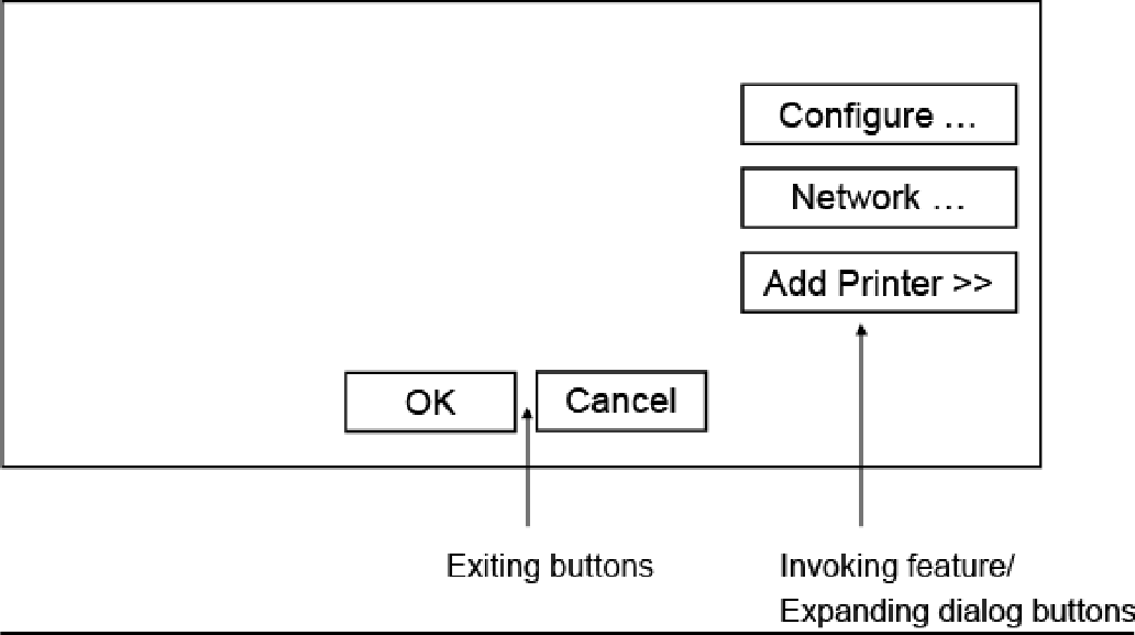
Buttons exiting a dialog, and usually closing the window, should be positioned horizontally and centered across the lower part of the window
For a button invokes a dialog or expands the dialog, position it centered and aligned vertically along the right side of the window
Do not provide alignment with other screen controls. Maintain alignment and spacing only within the buttons themselves
Position the buttons within windows before locating the other window controls
Command Buttons (Location and Layout)
If a button has a contingent relationship to another control, position it adjacent to the related control
Buttons found on more than one window should be consistently positioned
Command Buttons (Organization)
Most frequent actions to the left or top
Keep related buttons grouped together
Exception: Buttons containing excessively long labels may be wider
Windows Recommends
An affirmative action the left or above
The default first
OK and Cancel next to each other
Help last
Command Buttons (Intent Indicators)
No intent indicator is necessary, when a button causes an action to be immediately performed
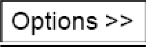
When a button leads to a cascading dialog, include and ellipsis (…)
When a button leads to a menu, include a triangle pointing in the direction the menu will appear after the label
When a button leads to and expanding dialog, include a double arrow(>>)
When a button has a contingent relationship to another control, include a single arrow
pointing at the control
Command Buttons (Expansion and Defaults)
Gray buttons after Expansion or when not applicable
When a window is first displayed, provide a default action, If practical
A default should be the most likely action:
A confirmation
An application of the activity being performed
A positive action such as OK
If a destructive action is performed (such as a deletion) the default should be Cancel
Indicate the default action by displaying the buttons with a bold or double border
Command Buttons (Keyboard Equivalents, Accelerators)
The mnemonic should be the first character of the button’s label
If duplication exists in first characters, use another character in the label
Designate the mnemonic character by underlining it
Assign a keyboard accelerator to each button to facilitate keyboard selection
Command Buttons (Scrolling and Button Activation)
Use buttons to move between multi-page forms, not scroll bars Label buttons Next and Previous
Highlight the button in some visually distinctive manner when the point is resting on it and the button is available for selection
Toolbars (Usage, Structure and size)
Provide easy and fast access to most frequently used commands or options across multiple screens
Provide buttons of equal size
Create a meaningful and unique icon
Center the image within the button
Create a meaningful label
Provide the smaller size as the default size with a user option to change it
Toolbars (Organization and Location)
Place the most frequently used actions to the left or the top
Keep related buttons grouped together
Separate potentially destructive buttons from frequently chosen selections
Permit user to reconfigure the button organization
Position main features and functions bar horizontally across top of window just below menu bar
Position subtask and sub features bars along sides of window
Permit the location of the bar to be changed by the user
Toolbars (Active items, Button Activation and Customization)
Make only currently available toolbar items available
Temporarily not available items by displaying grayed out
Highlight the button in some visually distinctive manner when the pointer is resting on it
Call attention to the button in another visually distinctive manner when it has been activated or pressed
Permit toolbars to be turned off by user
Allow the customizing of toolbars
Text Entry/Read-Only Controls (Captions) For entry boxes
Place a colon (:) immediately following the caption
For single fields, caption can be located in front of upper left corner of the box
For multiple fields, position the caption upper left of the box For read-only boxes
If the data field is long or about the same length, center the caption above the displayed textbox
If the data is alphanumeric, short, or quite variable in length, left-justify the caption above the displayed
If the data field is numeric and variable in length, right justify the caption above the displayed
Text Entry/Read-Only Controls (Fields)
To visually indicate that it is an enterable field, present the box in a recessed manner
Present read-only text boxes on the window background
Break up long text boxes through incorporation of slashes(/), dashes (-), spaces, or common delimiters
Call attention to text box data through a highlighting technique
Gray-out temporarily unavailable textboxes
Selection Controls
Radio Buttons
Checkboxes
Palettes
List Boxes
List View Controls
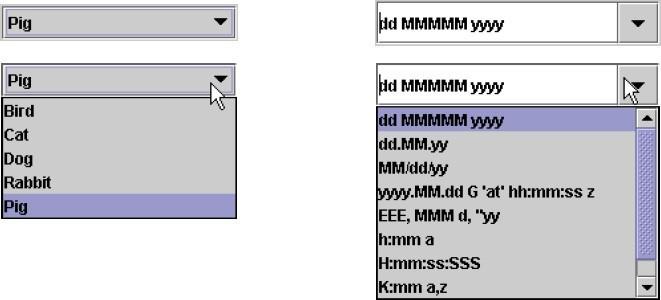
Drop-down/Pop-up List Boxes
Radio Buttons
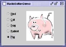
A two part control consisting of the following
Small circles, diamonds, or rectangles
Choice descriptions
When a choice is selected
The option is highlighted
Any existing choice is automatically un highlighted and deselected
Purpose
To set one item from a small set of option (2 to8)
For mutually exclusive choices (that is, only can be selected)
Most useful for data and choices that are
Discrete
Small and fixed in number
Not easily remembered
Most easily understood when the alternatives can be seen together and compared to one another
Never change in content
Do not use
For commands
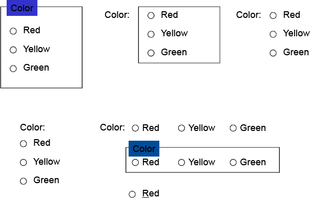
Radio Buttons (Defaults and Structure)
If there is a default selection, designate it as the default and display its button filled in. Else, display all the buttons without setting adopt
When a multiple selection includes choices, display the buttons in another unique manner, such as gray shadow
Left-align the buttons and choice descriptions
A columnar orientation is the preferred unless vertical space on the screen is limited
Enclose the buttons in a border to visually strengthen the relationship
Radio Buttons (Organization, Related Control)
Arrange selection in expected order or follow other patterns (frequency of occurrence, sequence of use, or importance)
Position any control related to a radio button immediately to the right of the choice description. End the label with an arrow
Radio Buttons (Captions)
Display full spelled out in mixed-case letters, capitalizing the first letter of all significant words
Columnar orientation
With a control border, position the caption:
Upper-left-justified within the border
Alternatively, to the left of the topmost choice description with (:)
Without a control border position, the caption:
Left-justified above the choice description with (:)
Alternatively, the caption may be located to the left of the topmost choice description with (:)
Horizontal orientation
Position the caption to the left of the choice
Alternatively, with a control border, left-justified within the border
Radio Buttons (Keyboard Equivalents and Selection and Indication)
Assign a keyboard mnemonic to each choice description by underlining the applicable letter in the choice description
Highlight the selection choice in some visually distinctive way when the cursor’s resting on it
When a choice is selected, distinguish it visually from the unselected choices
If there is a default choice, display the selected choice as set in the control
Radio Buttons
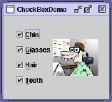
Check Boxes
Each option acts as a switch and can be either “on” or “off”
When an option is selected, a mark (X) appears within the square box, or the box is highlighted in some other manner
Otherwise the square is unselected or empty(off)
Each box can be
Switched on or off independently
Used alone or grouped insets
!!Other properties are similar to the radio button’s properties!! Palettes
Acontrolconsistingofaseriesofgraphicalalternatives.Thechoicesthemselves are descriptive, being composed of colors, patterns, or images
To set one of a series of mutually exclusive options presented graphically or pictorially
Usually consume less screen space than textual equivalents
Do not use
Where the alternatives cannot be meaningfully and clearly represented pictorially
Where words are clearer than images
Where the choices are going to change
Create boxes of equalize
Position the boxes adjacent to, or butted up against another
A columnar orientation is the preferred manner
Top to button, Left to right ordering by expected order, frequency of occurrence, sequence of use or alphabetically
Display it less brightly than the other choices, if a choice is not available
Highlight the choice in some visually distinctive way when the pointer is resting
When a choice is selected, distinguish it visually from the unselected choices
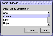
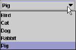
List Boxes
A permanently displayed box-shaped control containing a list of attributes or objects from which
A single selection is made (mutually exclusive),or
Multiple selections are made (non-mutually exclusive)
Unlimited number of choices
If the list content change, items will be hard to find
Good for data that are
Best represented textually
Not frequently selected
Large in number
Fixed in list length
Clearly and meaningfully describe the choices available
Present in mixed case
Left-align into columns
Require no more than 40 page-downs to search a list
If more are required, provide a method for using criteria
Must be long enough to display 6-8choices
If it is the major control within a window, the box may be larger
When box can’t made wide enough to display longest entry
Break the long entries with an ellipsis (…)
Provide horizontally scrolling
Order in a logical and meaningful way to permit easy browsing (allow user to change the sort order will be great)
If a particular choices is not available in the current context, omit , gray or dimity
Enclose the choices in a box with a solid border
Use mixed-case
Preferred position of the control caption is above upper-left
When a list box is disabled, display its caption as gray out
Highlight the selection choice when the pointer is resting on
Single-Selection List Boxes

If presented with an associated text box control
Position the list box below and as close as possible to the textbox
The list box caption should be worded similarly to the text box caption
If the related text box and the list box are very close, the caption may be omitted from the list box
When the list box is first displayed
Present the currently active choice highlighted or marked with a circle or diamond to the left of the entry
If a choice has not been previously selected, provide a default choice and display it in the same manner that is used in selecting it

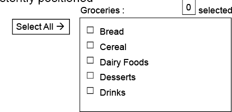
Multiple-Selection List Boxes
Mark the selected choice with an X or check mark to the left of the entry
Consider providing a summary list box
Position it to the right of the list box
Use the same color for the summary list box
Consider providing a display-only text control indicating how many choices have been selected
Position it justified upper-right above the list box
Provide command buttons for Select All and Deselect All
When the list box is first displayed
Display the currently active choices
Mark with and X or check mark to the left of the entry
Drop-Down/Pop-up List Boxes
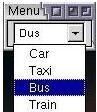
Unlimited number of choices
When displayed, all choices may not always be visible, requiring scrolling
Use drop-down/pop-up when
Screen space or layout consideration makes radio buttons or single- selection list boxes impractical
Do not use a drop-down list if it important that all options be seen together.
Provide a visual cue that a box is hidden by including a downward pointing arrow, or other meaningful image
! Other properties are the same as List boxes!
Combination Entry/Selection Controls and Other Operable Controls
Spin Boxes
Combo Boxes
Drop-down/Pop-up Combo Boxes
Slider
Spin Boxes
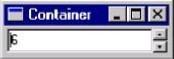
A single line field followed by two small, vertically arranged buttons (pointing up and pointing down arrow)
Selection/entry is made by
Using the mouse to point at one of directional buttons
Keying a value directly into field itself
Consumes little screen spaces
Useful only for certain kinds of data
Proper usage for
For mutually exclusive choices
Where screen is space is limited
Small in number
Infrequently changed, selected
To reduce the size of potentially long lists, break the listing into subcomponents (break a date into ddmmyyyy)
When first displayed, present a default choice in the box
The spin box should be wide enough to display the longest entry or choice
Caption is mixed-case letters
Position the caption to the left of the box
Alternatively, left-justified above the box
For numeric values
Show a larger value using the up arrow
Combo Boxes
A single rectangular text box entry field, beneath which is a larger rectangular list box (resembling a drop-down list box)
The text box permits a choice to be keyed within it
As text is typed into the text box, the list scrolls to the nearest match
Also, when an item in the list box is selected, that item is placed within the text box
Drop-down/Pop-up combo Boxes
A single rectangular text box with a small button to the side and an associated hidden list of options
Selection are made by using the mouse or keyboard
The information keyed doesn’t not have to match
Unlimited number of entries and choices
Flexible, permitting selection or typed entry
Requiring scrolling
Proper usage
Where screen is limited
For data and choices that are
Best represented textually
Frequently changed
Large in number
Drop-down/Pop-up combo Boxes
Provide a visual cue that a list box is hidden by including a downward-pointing
Other properties are the same as Drop-down/Pop-up List Box!!
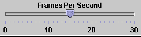
Slider
A scale exhibiting degrees of a quality on continuum
To make a setting when a continuous qualitative adjustment is acceptable
Spatial representation of relative setting
Not as precise as an alphanumeric indication
Proper usage:
When an object has a limited range of possible settings
When the range of values discontinuous
When graduations are relatively fine
Custom Controls
Presentation controls
Provide details about other screen elements or controls or assist in giving the screen structure
Static Text Fields
Group boxes
Column Headings
ToolTips
Balloon Tips
Progress indicators
Task Best Control If screen Space Constraints Exist
Mutually Exclusive Radio Buttons Drop-down/Pop-up List Box
Not Mutually Exclusive Check Boxes Multiple-Selection List Box
Select or Type a Value
Text Entry Field
Radio Buttons with“ Other”
Drop-down Combo Box
Setting a Value within a Range
Spin Button Text Box
Write Clear Text and Message Words
Do not use technical words, made-up words or terms file spec, abed, or spool, Ungroup or dear chive
Do not use abbreviations or acronyms
– Always use the fully spelled-out form the first time it is encountered in the interface
Consider the usage of contradictions or short forms (won’t vs. will not, un- - nests), Complete words is preferred
Positive terms (avoid the prefix “ire-” “in-” “dies-” adnoun-”)
Simple action words (“Project status listing” “List”)
Consistency
Multiple-word phrases are more readable if the entire phrase is on one line
Abbreviation, mnemonics, and acronyms should not include punctuation
Sentences and Messages
Brief and simple
Directly and immediately usable (Should not search through reference)
Affirmative statement is easier to understand than negative statements
Active voice is usually easier to understand than passive voice
Main topic at the beginning
Use the same grammatical structure for elements of sentences
Imply that the system is awaiting the user’s direction, not that the system is directing the user
Negative tones or actions, or threats are not very friendly (“Numbers are illegal” vs.
“Months must be entered by name”)
Encouraging message would be better than insulting message
Should remain factual and informative, and should not attempt humor or punishment
Messages
Screen messages is classified into two categories
System messages:
Generated by the system to keep the user informed of the system’s state and activities
Instructional messages (prompting message):
tell the user how to work with, or complete the screen displayed
System Messages
Status messages
Providing information concerning the progress of a lengthy operation
Usually contains a progress indicator and a short message
Informational messages (notification messages)
This kind of message is usually identified by an “I” icon to the left of the message
Warning messages
They are usually identified by an“!”
The user must determine whether the situation is in fact a problem and may be asked to advise the system whether or not to proceed (A deletion request by a user is any action that commonly generates a warning messages)
System Messages
Critical messages (Action messages)
Call attention to conditions that require a user action before the system can proceed
Some products use a “Do Not” symbol while others use a “Stop” sign. An X in a circle used by Microsoft Windows
Question messages
A question message asks a question and offers a choice of options for selection
It is designated by a “?” icon proceeding the message text
Writing Message Box Text
Title bar: Clearly identify the source of the message
The name of the object to which it refers
The name of the application to which it refers
Do not include an indication of message type
Use mixed case in the headline style
Message box: Provide a clear and concise description of the condition of the condition causing the message box to be displayed
Use complete sentences with ending punctuation
Show only message box about the cause of condition in single message
Make the solution an option offered in the message
Use the word “Please “conservatively
Do not exceed two or three lines
Center the message text in window
Include the relevant icon identifying the type of message
Message Box Controls
Command Buttons:
If a message requires no choices to be made, include an OK button
If a message requires a choice to be made
OK and Cancel buttons only when the user has the options continue or cancel
Yes and No buttons when the user must decide how to continue
If these choices are too ambiguous, label with the name of specific actions
If a message describes an interrupted process, provide Stop button
If a message offer a chance to cancel a process, provide a Cancel button
If more details about a message must be presented, provide a Help button
Display only one message box for a specific condition
Close Box:
Enable the title bar Close only if the message includes a Cancel button
Instructional Messages
Provide instructional information at the depth of detail needed by the user
Accessing instruction through a Help function is the best solution
Location it at strategic position on the screen
Display it in a manner that visually differentiates it from other screen elements
In writing, follow all relevant writing guideline for words, sentences, and messages
Create Meaningful Graphics, Icons and Images
Creating Images
Create familiar and concrete shapes
Create visually and conceptually distinct shapes
Incorporate unique features of an object
Do not display within a border
Clearly reflect object represented
Simple reflect object represented, avoiding excessive detail
Create as a set, communicating relationships to one another through common shapes
Provide consistency in icon type
Create shapes of the proper emotional tone
Icons
Icons are most often used to represent objects and actions with which users can interact
Icons may stand alone on a desktop or in a window, or be grouped together in a toolbar
A secondary use of a icon is to reinforce important information, a warning icon in a dialog message box
Characteristics of Icons
Syntactic refers to a icon’s physical structure
Shape, Color, Size
Similar shapes and colors can be used to classify a group of related icons
Semantics is the icon’s meaning
What does it refer – a file, a waste basket, or some other objects?
Pragmatics is how the icons are physically produced and depicted
Is the screen resolution enough to illustrate?
Syntactic, semantics and pragmatics determine an icon’s effectiveness and usability
Influences on Icon Usability
Provide icons that are
Familiar
Clarity
Simple
Consistent
Directness of the meaning
Efficient
Discriminate able from others
Also consider the
Context in which the icon issued
Expectancies of users
Complexity of task
Choosing Icons
A Successful Icon
Looks different from all other icons
Is obvious what it does or represents
Is recognizable when no larger than 16 pixels square
Look as good in black and white as in color
Size
– 16x16, 24x24, 26x26, 32x32 pixels 16-and-256 color version
Use colors from the system palette
Provide as large a hot zone as possible
With stylus or pen: 15 pixels square
With mouse: 20 pixels square
With finger: 40 pixels square
Choosing Images
Use existing icons when available
Use images for nouns, not verbs
Use traditional images
Consider user cultural and social norms
Creating Images
Create familiar and concrete shapes
Create visually and conceptually distinct shapes
Incorporate unique features of an object
Do not display within a border
Clearly reflect object represented
Simple reflect object represented, avoiding excessive detail
Create as a set, communicating relationships to one another through common shapes
Provide consistency in icon type
Create shapes of the proper emotional tone
Drawing Images
Providing consistency in shape over varying sizes
Do not use triangular arrows in design to avoid confusion with other system symbols
When icons are used to reflect varying attributes, express these attributes as meaning meaningfully as possible
Provide proper scale and orientation
Use perspective and dimension whenever possible
Accompany icon with a label to assure intended meaning Icon Animation and
Audition
Animation
Use
To provide feedback
For visual interest
Make it interruptible or independent of user’s primary interaction
Do not use it for decoration
Permit it to be turned off by the user
For fluid animation, present images at 16++ frames/second
Auditions
Consider auditory icons
The design Process
Define the icon’s purpose and use
Collect, evaluate, and sketch ideas
Draw in black and white
Draw using an icon-editing utility or drawing package
Test for users
Expectations
Recognition
Learning
Test for clarity
Register new icons in the system’s registry
Graphics in Web
Use Graphics to
Supplements the textual content, not as a substitute for it
Convey information that can’t be effectively accomplished using text
Enhance navigation through
Presenting a site overview
Identifying site pages
Identifying content areas
Images
Limit the use of graphics that take long time to load
Coordinate the graphics with all other page elements
Use standard images, image internationalization
Provide descriptive text or labels with all images
Distinguish navigational images from decorative images
Minimize
The number of presented images
The size of presented images
Image animation
Number of colors
GIF, JPEG is preferred
Photographs/Pictures
Use when every aspect of the images is relevant
Use JPEG format
On the initial page
Display a small version
A thumbnail
Zoom-in on most relevant detail
Link to larger photos showing as much detail as needed
Video
To show the proper way to perform a task
To provide a personal message
To grab attention
Never automatically download a video into a page
Provide controls (playing, pausing, and stopping)
Considering using
Existing video
Audio only
A slide show with audio
Diagrams
To show the structure of objects
To show the relationship of objects
To show the flow of a process or task
To reveal a temporal or spatial order
Animation
To explain ideas involving a change in
Time
Position
To illustrate the location or state of a process
To show continuity in transitions
To enrich graphical representations
To aid visualization of 3-Dstructures
Provide a freeze frame and stop mode
Avoid distracting animation
Audition
Uses as a supplement to text and graphics
To establish atmosphere
To create a sense of place
To teach
To sample
The content should be simple
Provide audio controls
Combining Mediums
Use sensory combination that work best together
Auditory text with visual graphics
Screen text with visual graphics
Both the visual and auditory information should be totally relevant to the task being performed
Visual and auditory textual narrative should be presented simultaneously
Considering downloading times when choosing media
Testing
Legibility
Comprehensibility
Acceptance
Choose the Proper Colors
Color Uses
Use color to assist in formatting
Relating elements into grouping
Breaking apart separate groupings of information
Highlighting or calling attention to important information
Use color as visual code to identify
Screen captions and data
Information from different sources
Status of information
Use color to
Realistically portray natural objects
Increase screen appeal Possible Problems with Color
High Attention-Getting Capacity
Viewer might associate, tie together, screen elements of same color
Result in confusing, slower reading
Interference with Use of Other Screens
Varying Sensitivity of the Eye to Different Colors
Viewing red and blue Eye fatigue
Color-Viewing Deficiencies
Cross-Disciplinary and Cross-Cultural Differences
For financial mangers - Corporate qualities or reliability
For health care professionals –Death
For nuclear reactor monitors – Coolness or water
For American movie audiences – Tenderness or Pornography Choosing Colors for Categories of Information
Color chosen to organize information or data on a screen must aid the transfer of information from the display to the user, Some examples of using color code
If decisions are made based on the status of information on the screen, color- code the types of status the information
Screen searching is performed to locate information of particular kind, color- code for contrast
If the sequence of information use is constrained or ordered, use color to identify the sequence
If the information on a screen is crowded, use color to provide visual grouping
Never rely on color as the only way of identifying a screen element
Always consider how spatial formatting, highlighting, and messages may also be useful
Color in Context
Usage
Color are subject to contextual effects
Small adjacent colored images may appear to the eye to merge or mix
A color on a dark background will look lighter and brighter than the same color on a light background
Colors also change as light levels change
Design for monochrome first or in shades of black, white and gray
Doing this will permit the screen to be effectively used:
By people with a color-viewing deficiency
On monochrome displays
In conditions where ambient lighting distorts the perceived color
If the color ever fails
Use colors conservatively
Do not use color where other identification techniques, such as location, are available
Discrimination and Harmony
Select 4-5 colors for best absolute discrimination
Red, yellow, green, blue, and brown
Select 6-7 colors for best comparative discrimination
Orange, yellow-green, cyan, violet, and magenta
Choose harmonious colors
One color plus two colors on either side of its complement
Three colors at equidistant point around the color circle
For extended viewing or older viewers, use brighter colors
Emphasis
To draw attention or to emphasize elements, use bright or highlighted colors or use less bright colors for deemphasize
The perceived brightness of colors from most to least is white, yellow, green, blue, red
To emphasize separation, use contrasting colors
Red and green, blue and yellow
To convey similarity, use similar colors
Orange and yellow, blue and violet
Common Meanings
To indicate that actions are necessary, use warm colors
Red, orange, yellow
To provide status or background, use cool colors
Green, blue, violet, purple
Conform to human expectation
Red: Stop, fire, hot, danger
Yellow: Caution, slow, test
Green: Go, OK, clear, vegetation, safety
Blue: Cold, water, calm, sky, neutrality
Gray, White: Neutrality
Warm colors: Action, response required, spatial closeness
Cool colors: Status, background information, spatial remoteness
Typical implications of color with dramatic portrayal are
High illumination: Hot, active, comic situations
Low illumination: Emotional, tense, tragic, romantic situations
High saturation: Emotional, tense, hot, comic situations
Warm colors: Active, leisure, recreation, comic situations
Cool colors: Efficiency, work, tragic and romantic situations
Proper use of color also requires consideration of the experiences and expectation of the screen viewers
Location and Ordering
In the center of the visual field, use red and green For peripheral viewing, use blue, yellow, black, and white
Use adjacent colors that differ by hue and value or lightness for a sharp edge and maximum differentiation
Order colors by their spectral position
Red, orange, yellow, green, blue, indigo, violet Foregrounds and Backgrounds
Foregrounds
Use colors that highly contrast with the background color
For text or data
Black on light-color background of low intensity (no bright white)
Desiderated spectrum colors such as white, yellow, or green on dark background
Warmer more active colors
To emphasize an element, highlight it in a light value of the foreground color, pure white, or yellow
To deemphasize and element, lowlight it in a dark value of the foreground color
Foregrounds and Backgrounds
Backgrounds
Use colors that do not compete with the foreground
Use
Light-colored backgrounds of low intensity: Off-white or light gray
De saturated colors
Cool, dark colors such as blue or black
Colors on the spectral extreme end
Blue, black, gray, brown, red, green, and purple
Gray Scale
For fine discrimination use a black-gray-white scale
Recommend values
White: Screen background, text located in any black area
Light gray: Background of a Pushbutton area
Medium gray: Icon background area, Menu drop shadow, Window
Drop shadow, inside area of system icons, Filename bar
Dark gray: Window boarder
Black: Text, Window title bar, Icon border, Icon elements,
Ruled lines
Text in Color
Text in color is not as visible as it is in black
When switching text from black to color
Double the width of lines
Use bold or larger type:
If originally 8 to 12 points, increase by 1 to 2points
If originally 14 to 24 points, increase by 2 to 4points
Text in Color
Text in color is not as visible as it is in black
When switching text from black to color
Double the width of lines
Use bold or larger type:
If originally 8 to 12 points, increase by 1 to 2points
If originally 14 to 24 points, increase by 2 to 4points
Check legibility by squinting at text
Too-light type will recede or even disappear
Choosing color for web pages
Always minimize the number of presented colors for faster downloading
Always consider color in context, never in isolation
Use similar or same color schemes throughout a Web site help the user maintain a sense of place
Foreground colors should be a different as possible from background colors
The most recommended foreground text color is black presented on a light-colored background of low intensity (off white or light gray)
Use dark backgrounds when establishing contrast between an area of the screen and the main screen body Choosing color for web pages
High intensity colors as back-ground such as red, magenta and bright green) must be avoided
When choosing foreground and background colors, ensure that contrasting combinations are selected
Use a uniform color in large screen areas
Large areas of the same color download faster
For smaller element, the more contrast is required
Use flat Web-safe colors
Select color that can be easily reproduced in black and white
Use of Color to Avoid
Relying exclusively on color (Spatial Formatting and component locations)
Too many colors at onetime
Highly saturated, spectrally extreme colors together
Red/blue and yellow/purple
Yellow/blue, green/blue and red/green
Low-brightness color for extended viewing or older viewer
Colors of equal brightness
Colors lacking contrast
Fully saturated colors for frequently read screen components
Use of Color to Avoid
Pure blue for text, thin lines, and small shapes
Colors in small areas
Colors for fine details
Black, gray, and white will provide better resolution
Other colors for large area or attracting attention
Non-opponent colors
Red/yellow or green/blue
Recommend: Red/green or yellow/blue
Red and green in the periphery of large-scale displays
Yellow and blue are much better
Use of Color to Avoid
Adjacent colors only differing in the amount of blue they posses
Single color distinctions for color-deficient user
Using colors in unexpected ways
Using color to improve readability of densely packed text


No comments:
Post a Comment